CREATING THE COVER FOR YOUR BOOK AND GETTING IT "PRINT READY" FOR SELF-PUBLISHING ON AMAZON
The whole process of getting the cover of your book “print ready” for Amazon is one of the more difficult and convoluted processes in the whole self-publishing process for new authors; besides, of course, the actual writing of the book and getting it properly edited. Even knowing which size template to use for a mass market paperback is difficult to understand. While there are a lot of author websites and blogs that talk about different aspects of the process, none that I ran across in my searches warned you about the typical pitfalls of the self-publishing process that a new writer should be aware of. Luckily this gave me a lot of material to write about for my blog. With Destiny’s release I plan to post as many of the points I missed the first time around.
When you first go to https://www.createspace.com to start the book creation process, one of the first things you need to make a decision on is the size of your book. Well, that and whether or not you to use an ISBN or an ASIN number. You can check my previous blog for that whole option here: http://www.thecheekyfellow.com/home-blog/what-are-asin-and-isbn-numbers-and-why-do-i-need-them The short of it is to just go with the free ASIN and save yourself the cost, but back to our “print ready” cover. Even if you want to only have an eBook at https://kdp.amazon.com, Amazon requires that you first create a print book and format it properly. Only then does Amazon allow you to convert that printed book into an eBook, so no matter what you are forced to build two separate templates; one template for your physical book and one for your eBook. Also, each different size book requires you to reformat your text to fit the new template you choose to additionally use. This includes restructuring the cover for your book. The one good thing is that the cover template for the physical book and the eBook can be used without changes, but that total text restructuring between the two types of books is time consuming. One additional side note: when you go with an audio version of your book you’ll need to reform the cover for your book to fit the audio book’s unique requirements, which are very different than either the physical or eBook formats.
Another annoying point I ran into with the release of Flight and something that I couldn’t find any information about at the time was that the smallest book you can go with on Amazon is the 5.06 X 7.81 template, which is as close as you can get to a normal sized mass market paperback that we all are familiar with when self-publishing through Amazon. It’s confusing when you get to the template choice for your book and nothing fits what you’re expecting as you measure one of your paperbacks at home and compare it to the selection that Amazon gives you for templates to choose from, so hopefully this part of the blog helps you at this point especially. After much research I discovered that Amazon doesn’t allow you to self-publish a normal sized mass market paperback book. One additional FYI on this point, the 5.06 X 7.81 template is slightly larger than a normal sized paperback book.
A slight rant: I guess Amazon wanted their paperback to stick out slightly on any bookshelf. While a part of me found this to be annoying, I will say that at least I found the quality of the physical books from Amazon to be exceptionally good. Something that makes you proud to hand out/sell when friends and colleagues question if you’re a “real writer” or do you actually have a “physical book” of your work. For some reason, if you only had an eBook published people think that’s quaint, but if you actually have a printed book in the hand, you’re taken more seriously as a writer. It doesn’t make any sense. Most of your sales will be eBooks and not physical books, but that doesn’t matter, people will still judge you on having a “physical book” of your work.
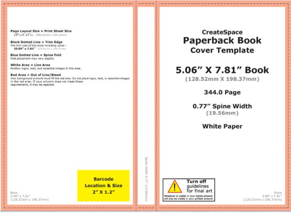
Carrying on with the publishing process, once you download the template you’ll have one for the cover and one for the text. The cover template looks like this:
When you first go to https://www.createspace.com to start the book creation process, one of the first things you need to make a decision on is the size of your book. Well, that and whether or not you to use an ISBN or an ASIN number. You can check my previous blog for that whole option here: http://www.thecheekyfellow.com/home-blog/what-are-asin-and-isbn-numbers-and-why-do-i-need-them The short of it is to just go with the free ASIN and save yourself the cost, but back to our “print ready” cover. Even if you want to only have an eBook at https://kdp.amazon.com, Amazon requires that you first create a print book and format it properly. Only then does Amazon allow you to convert that printed book into an eBook, so no matter what you are forced to build two separate templates; one template for your physical book and one for your eBook. Also, each different size book requires you to reformat your text to fit the new template you choose to additionally use. This includes restructuring the cover for your book. The one good thing is that the cover template for the physical book and the eBook can be used without changes, but that total text restructuring between the two types of books is time consuming. One additional side note: when you go with an audio version of your book you’ll need to reform the cover for your book to fit the audio book’s unique requirements, which are very different than either the physical or eBook formats.
Another annoying point I ran into with the release of Flight and something that I couldn’t find any information about at the time was that the smallest book you can go with on Amazon is the 5.06 X 7.81 template, which is as close as you can get to a normal sized mass market paperback that we all are familiar with when self-publishing through Amazon. It’s confusing when you get to the template choice for your book and nothing fits what you’re expecting as you measure one of your paperbacks at home and compare it to the selection that Amazon gives you for templates to choose from, so hopefully this part of the blog helps you at this point especially. After much research I discovered that Amazon doesn’t allow you to self-publish a normal sized mass market paperback book. One additional FYI on this point, the 5.06 X 7.81 template is slightly larger than a normal sized paperback book.
A slight rant: I guess Amazon wanted their paperback to stick out slightly on any bookshelf. While a part of me found this to be annoying, I will say that at least I found the quality of the physical books from Amazon to be exceptionally good. Something that makes you proud to hand out/sell when friends and colleagues question if you’re a “real writer” or do you actually have a “physical book” of your work. For some reason, if you only had an eBook published people think that’s quaint, but if you actually have a printed book in the hand, you’re taken more seriously as a writer. It doesn’t make any sense. Most of your sales will be eBooks and not physical books, but that doesn’t matter, people will still judge you on having a “physical book” of your work.
Carrying on with the publishing process, once you download the template you’ll have one for the cover and one for the text. The cover template looks like this:
Now you need to have your base image that you’re going to use for your cover. I have several posts about cover creation process and this is the only area where I outsourced the work. It costs, but if you’re smart and shop around you can find artists that are good and affordable. Also, it’s the only way most of us can get a truly high-quality, professional image for our work that we can use to compete with a normal publisher’s cover art. Some of my previous posts on the importance of a good cover is here: http://www.thecheekyfellow.com/home-blog/self-publishing-finding-an-artist-for-your-book and here http://www.thecheekyfellow.com/home-blog/cover-design-and-book-twos-artwork The basic image file I received back from the artist Leoblack is the PDF below. He also gave me one that was just a pure image, but I chose to use his title design this time around because it just rocks.
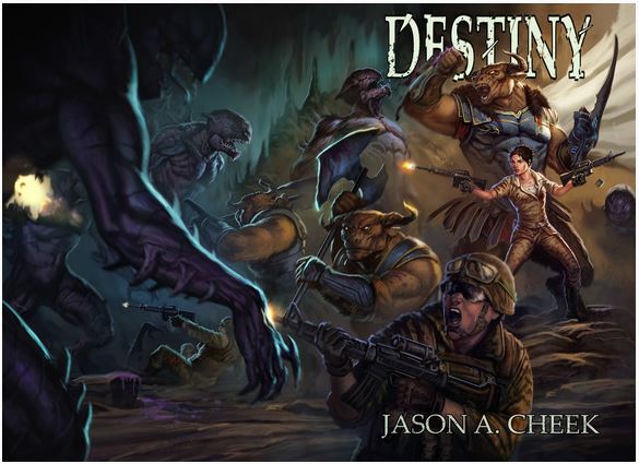
One of the things I requested from the artist I’m working with is to have the option to remove the text that they’ve inserted to be able to replace it with my own design and format. On both of my books the title has been slipped behind parts of the main character, and I need that graphic layer available to be able to make any future changes I desire. On the image for Destiny, I really like how DLeoBlack did the font for the Title and my name, so I kept his design. I also made sure to ask DLeoBlack for the name of the font he used ahead of time. This is important for the creation of the rest of the text on the cover, since sometimes it’s hard to know just by going through the lists of fonts which one your artist actually used. Having the same font used throughout the text on the cover is an important design concept in graphic design. Not using multiple fonts on your cover design will help give your work that “professional look” to its overall layout and design. While I didn’t keep the exact “title” that DLeoBlack used for the back cover of the book and the spine, I did keep the same font and the general drop shadow and bevel/emboss stylized look that he used on the front cover’s title.
While this post is not a tutorial on how to work with Photoshop and the program’s various effects, I would like to point out the design concept of using multiple layers so that you can keep each of your text, their effects and position separate. It makes moving, resizing and finding the text in question a lot easier at this point in the process. You don’t need to use Photoshop for this process. Paint Shop Pro was an old standby I always used before I was able to get a copy of Photoshop. At the time layers weren’t part of the program, but now must graphic applications have layers. The good thing about Photoshop is that it imports nicely into Illustrator, which is kind of important for the “Print Ready” graphic that I want to have produced at the end of this process. I’m sure there are other applications out there that could do the same thing, I just don’t know them, so I’ll be showing you my process using Illustrator.
Once you have the image looking the way you want it, the next step is to save your work with your multiple layers. You’ll need this for getting the next step correct. At this point in time I make a separate image and flatten the layers into one image. I copy this and then open the template for the cover I downloaded from Amazon inside Illustrator. Just a warning, the template will not automatically open in Illustrator.
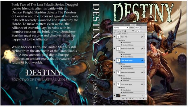
Now paste the image from your graphic program, Photoshop for me, into the template you have open in Illustrator. The image will be huge and cover the template. You’ll want to move the image’s opaque transparency settings down to something like 50% and resize the edges of the image until it is completely covering the outside edge of the template. The semi-finished product will look something like the graphic below, but once you have it in place you will want to set your image’s transparency settings back to 100%.
Once you have the image looking the way you want it, the next step is to save your work with your multiple layers. You’ll need this for getting the next step correct. At this point in time I make a separate image and flatten the layers into one image. I copy this and then open the template for the cover I downloaded from Amazon inside Illustrator. Just a warning, the template will not automatically open in Illustrator.
Now paste the image from your graphic program, Photoshop for me, into the template you have open in Illustrator. The image will be huge and cover the template. You’ll want to move the image’s opaque transparency settings down to something like 50% and resize the edges of the image until it is completely covering the outside edge of the template. The semi-finished product will look something like the graphic below, but once you have it in place you will want to set your image’s transparency settings back to 100%.
At this point you will see this black outline of a square on top of the image. In Illustrator this is the print area. This is easy to change by dragging the outlines of the print area. One way is to click on File, Document Setup and Edit Artboards. Another is to click on effects, artboards and selected images, but either way you will want your artboard to highlight this image only. You can confirm your print selection in the print preview options.
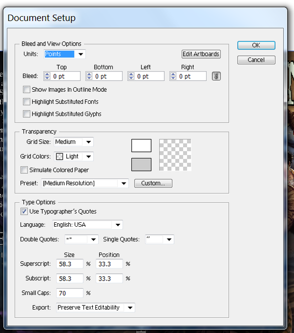
Once you have this selected properly you are ready for the next very important step. It is essential that you do not “print to PDF”. Print to a PDF will not work for a “print ready” image and will leave a white boarder around your image that Amazon will deny for your “print ready” graphic for your cover. The trick here is to File, Save As and select the output to be a PDF and not an AI extension for Illustrator. At this point you can select the settings that are in the instructions for formatting the compression of the image. Settings like the Compatibility to be Acrobat 4 (PDF 1.3) and the Standard to be PDF/X-1a:2003 and setting your compression on the image.
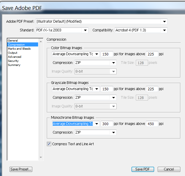
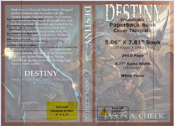
If you leave your Color Bitmap Image & Grayscale Bitmap Image compress at 150 ppi & 225 ppi you’ll get an image that’s around 5 to 6 MBs in size. If you up these settings to 300 ppi & 450 ppi you’ll get an image around 18 to 20 MBs in size. Doing zero compression will leave you an image size approximately 50 to 60 MBs in size. In the past I’ve used the 5 to 6 MB sized files, but this time I might try the 18 to 20 MB sized file for my image. Once you “Save PDF” you’ll see your PDF image has no boarders if you did everything correctly. It should look something like the image below:
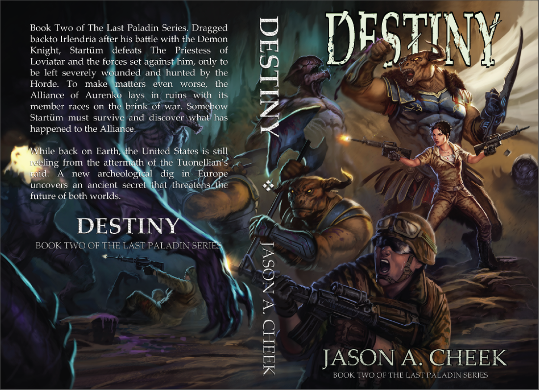
While this looks finished, I’m still tweaking the back cover’s hook. Interestingly enough, when you print out the image and share it with your friends in this format you end of getting a lot of good feedback. There is something about having the image in your hand that allows you to see mistakes or areas to improve better than on the screen. As you can see I’ve justified the text for the hook, lined up the spine’s Title and Author name a little better and corrected some of the spacing issues between the edge of the book and the spine. Since I’ve documented the whole process, this will be a piece of cake to jump back into Photoshop to make the needed corrects and then recreate the images I need via Illustrator. I probably could have done much of the text work in Illustrator, but I’m better in Photoshop and there seemed to be a lot more built in effects to apply to my text.
I hope this post helps those of you who are working hard to get that first book published. For me this post will work as an excellent procedure to have for future publishing, since by the time I’m pushing out book three I will have forgotten this process again. For now, I’m wishing everyone a great weekend and signing off.
I hope this post helps those of you who are working hard to get that first book published. For me this post will work as an excellent procedure to have for future publishing, since by the time I’m pushing out book three I will have forgotten this process again. For now, I’m wishing everyone a great weekend and signing off.