Coming up with a “cover idea” is not the easiest thing to do. In my mind, you need to find a cover that conveys the idea of your story or shows an action scene. The idea should be something that is eye catching. A book cover is a writer’s first means of advertising to their prospective audience. It should be something that catches a reader’s eyes and making them want to pick up your book to read the back cover, which is the secondary primary means of advertising for an author. (Wow, that whole back cover blurb should be my next blog series of discussions, but for now let’s keep the focus on the cover art.) The last part of this direct advertising is your front cover blurb and your sample pages from your novel.
In my opinion, there is nothing more important than your cover when it comes to your initial advertising. Getting someone to notice your book as a new writer and to actually check out what your story is about is the hardest part of advertising. I would go so far as to say that 80% to 90% of the people that decide to pick up your book due to the cover will probably choose to purchase your book if they like the back blurb about the story. What gets readers to get this far is the actual cover that catches their eyes.
Now for already famous writers this is not as important, but for us indie writers it is. We don’t already have a following of readers who want to check out our work, so we need to advertise and get people to notice our great story.
Now that we have an idea just how important the cover for your book, we can discuss the next part of the process. Before you can communicate your cover idea to your artist, you as the writer need to have a solid idea of what you want for the cover of your book. Sounds easy, right? Wrong, the whole process of coming up with a concept that rocks and then communicating that concept to your artist is extremely difficult. Also, you only have several tries with the artist you’re working with before they are going to say something like: We need to go with one of the concepts we’ve come up with or you’re going to need to pay me for all of the art work that you keep asking for. Also, covers are expensive and none of us have extra money to just throw away. Hell, as a new writer we are already gambling that all of the money we are spending now to get the book published in the first place is actually going to get enough of a return to pay for the initial cost of publishing our book, let alone actually make anything extra on top of that.
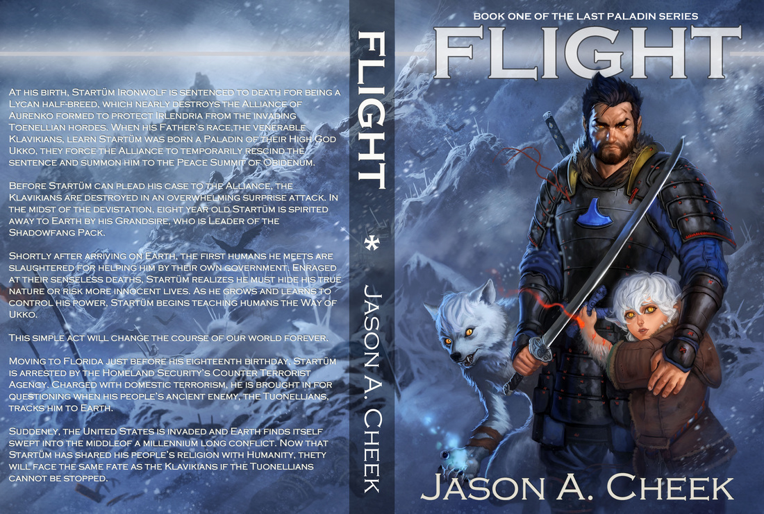
Once you have this mental picture of what you want your cover to be, you need to find a way to communicate this idea to the artist you’ve found. I do this in two different ways. First, I pull as many images that I can to convey the idea of what I’m thinking. I would post the file here that I use to do this, but with all of the focus on posting other people’s images illegally, I’ll just discuss the file I used to convey my thoughts instead. There are just way too many images to hunt down each artist to get permissions for this blog post. In the document I used to communicate with my artist I focused on several types of images. The first was the color pallet that I was looking for. I had several images that gave the impression of blowing snow with a bluish tinge to the scene. I also discussed the feeling I wanted to convey in the background of the picture. The second focus I had was on the art style I was looking for in the main characters. I was going for an anime with a slightly realistic look for the characters. I had a couple faces concepts that I wanted, but nothing exact. I had several pictures showing young women that were wolf-like in appearance. I wanted Starfire to look not quite human and to be a partial twin to the werewolf girl, Frostbrand, who is placed on the other side of Startüm. I had several pictures of the style of werewolf I was looking for. I also wanted the werewolf in question to look feminine and child-like. A tough request I’m sure, which Leo really kicked butt doing. Last, I had pictures of the armor style I wanted for the Startüm and the swords I wanted used.
Although I had specific ideas of what I wanted, I also left things loose for the artist’s own interpretation. I wanted to make sure I went with what the artist wanted to do to a point too. I did make some mistakes. I wish I had put Startüm as younger and with blonde hair to go better with the description within the pages of the book, but at the same time I really loved how the character on the cover looked Wolfish. It made me not want to change the image from what Leo came up with in that way.
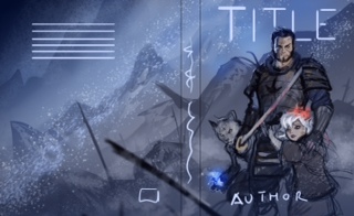
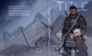
You can see the progression of the images from Leo. The first one was almost exactly what I was looking for. The only thing I didn’t like was the body language and the stance of the main character in Leo’s first try. Also, I wanted the character to look slightly more muscular and more aggressive. In the second try that Leo did I thought he hit this exactly, which is what I told him to go with. I wasn’t sure where the flame for Starfire should go. I initially had an idea that she was fiery all over, but I didn’t like the look in the first picture. Leo put it to her hand instead, which I thought came out great.
I’ll post information for the cover for Destiny and I hope this discussion helps those of you who are going through this process for the first time.
In my opinion, there is nothing more important than your cover when it comes to your initial advertising. Getting someone to notice your book as a new writer and to actually check out what your story is about is the hardest part of advertising. I would go so far as to say that 80% to 90% of the people that decide to pick up your book due to the cover will probably choose to purchase your book if they like the back blurb about the story. What gets readers to get this far is the actual cover that catches their eyes.
Now for already famous writers this is not as important, but for us indie writers it is. We don’t already have a following of readers who want to check out our work, so we need to advertise and get people to notice our great story.
Now that we have an idea just how important the cover for your book, we can discuss the next part of the process. Before you can communicate your cover idea to your artist, you as the writer need to have a solid idea of what you want for the cover of your book. Sounds easy, right? Wrong, the whole process of coming up with a concept that rocks and then communicating that concept to your artist is extremely difficult. Also, you only have several tries with the artist you’re working with before they are going to say something like: We need to go with one of the concepts we’ve come up with or you’re going to need to pay me for all of the art work that you keep asking for. Also, covers are expensive and none of us have extra money to just throw away. Hell, as a new writer we are already gambling that all of the money we are spending now to get the book published in the first place is actually going to get enough of a return to pay for the initial cost of publishing our book, let alone actually make anything extra on top of that.
Once you have this mental picture of what you want your cover to be, you need to find a way to communicate this idea to the artist you’ve found. I do this in two different ways. First, I pull as many images that I can to convey the idea of what I’m thinking. I would post the file here that I use to do this, but with all of the focus on posting other people’s images illegally, I’ll just discuss the file I used to convey my thoughts instead. There are just way too many images to hunt down each artist to get permissions for this blog post. In the document I used to communicate with my artist I focused on several types of images. The first was the color pallet that I was looking for. I had several images that gave the impression of blowing snow with a bluish tinge to the scene. I also discussed the feeling I wanted to convey in the background of the picture. The second focus I had was on the art style I was looking for in the main characters. I was going for an anime with a slightly realistic look for the characters. I had a couple faces concepts that I wanted, but nothing exact. I had several pictures showing young women that were wolf-like in appearance. I wanted Starfire to look not quite human and to be a partial twin to the werewolf girl, Frostbrand, who is placed on the other side of Startüm. I had several pictures of the style of werewolf I was looking for. I also wanted the werewolf in question to look feminine and child-like. A tough request I’m sure, which Leo really kicked butt doing. Last, I had pictures of the armor style I wanted for the Startüm and the swords I wanted used.
Although I had specific ideas of what I wanted, I also left things loose for the artist’s own interpretation. I wanted to make sure I went with what the artist wanted to do to a point too. I did make some mistakes. I wish I had put Startüm as younger and with blonde hair to go better with the description within the pages of the book, but at the same time I really loved how the character on the cover looked Wolfish. It made me not want to change the image from what Leo came up with in that way.
You can see the progression of the images from Leo. The first one was almost exactly what I was looking for. The only thing I didn’t like was the body language and the stance of the main character in Leo’s first try. Also, I wanted the character to look slightly more muscular and more aggressive. In the second try that Leo did I thought he hit this exactly, which is what I told him to go with. I wasn’t sure where the flame for Starfire should go. I initially had an idea that she was fiery all over, but I didn’t like the look in the first picture. Leo put it to her hand instead, which I thought came out great.
I’ll post information for the cover for Destiny and I hope this discussion helps those of you who are going through this process for the first time.
 RSS Feed