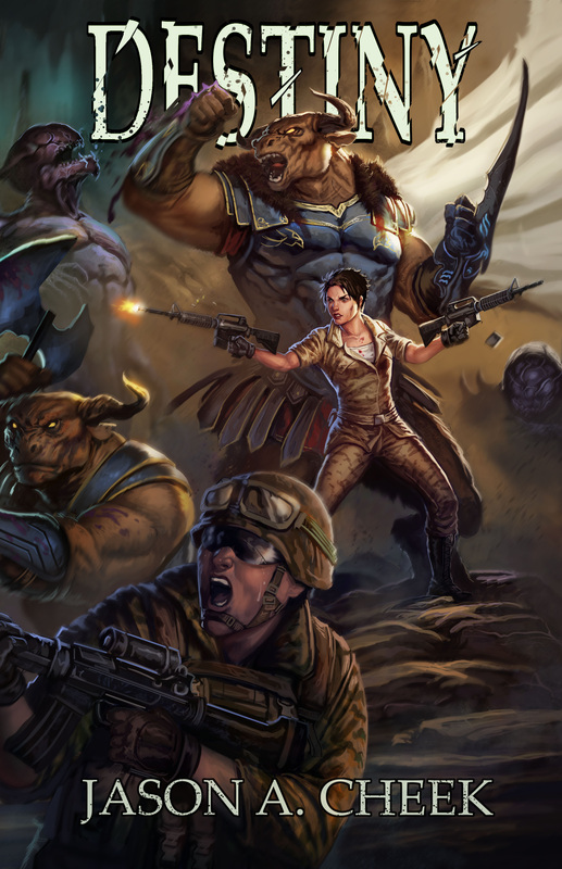
Now with Leo this is not a problem, he is an excellent artist and when we are working on a cover design I feel like we sync with each other. Also as I’ve stated before, while I have a pretty solid idea of the overall design I still trust Leo to make my ideas look good. I stated what I wanted for the main characters and what was important to me on how they looked, while letting him come up with something he thought looked good for the rest of the battle with a little input from me. Doing this allowed the cover to truly rock.
In the image below you see the two main characters for the front cover with the physical and emotional impact and body language I wanted shown. I went ahead and let Leo go with the two assault rifles, even though I had initially wanted a pistol and an assault rifle. Leo didn’t think it would give enough action if I did that and after running the idea by a few people it seemed like he was right. I’m sure this is part of the soldier in me wanting certain action scenes to have certain realism within its design. I know how crazy that sounds when I have Scourge and Minotaurs on the cover along with the Marines. Even so that’s how I feel. I felt with the clip being released on one assault rifle could signify that she is holding two rifles, but only firing them one at a time. Sergeant First Class Megan Driscoll of the Marine Raiders is pretty badass, but even she needs to focus fire.
The only change I made in Leo’s final design was to have the Marine woman given a dog tag around her neck. Due to how this is being released in worldwide, I wanted especially my fans in Australia, Europe, Canada and the USA to have the freedom to picture the soldier’s nationality as they wanted to. Also, in the story there are NATO troops going about doing their thing, but I figured this idea of no country/unit patches would affect readers looking at the cover on a more subconscious level.
The lead Minotaur doesn’t have a double-headed battle axe that he’s swinging one-handed like I’d originally planned, but I like how Leo did his right hand. I think the gauntlet punch comes off better for the overall image design. Also he looks like one powerful warrior.
The screaming Marine on the lower left of the cover and the smaller Minotaurs battle half visible on the front cover I hope will make people want to take a closer look at the cover and what the story is about. I loved how Leo positioned the warriors and brought the battle to life.
Lastly, I also worked with Leo on having the text slipped behind the Minotaur. I wanted it behind his fist and horns, but in front of his billowing cloak to give a sort of 3D effect to the cover. If this is something you'd like for your cover too then just make sure you work with your own artist to have a layer that you can update the font and the position they way you want it to look. Audio book covers and paperback/ebook sizes are different, so you need to be able to re-position the font as needed for each cover design. Having this built into the original image is necessary for this 3D layered effect and has to be done on the artist side. Any digital image can just leave those font layers open for you to adjust or edit or remove as needed. Of course you need to have Photoshop or a compatible software to do the work.
I'm not sharing the complete wrap around cover here just yet, but only the front of the cover portion of the image. There are more Minotaurs and Marines on the spine/back cover of the book. Once I get the book published I'll share out the whole image. Hopefully you all like it just as much as I do. I would love to hear your thoughts.

 RSS Feed