The initial concept idea I had for Destiny’s book cover came from two works of digital art that Ukitakumuki created in the Warhammer 40k universe. Due to copy write issues I’ll just post the links here for your viewing pleasure here: http://ukitakumuki.deviantart.com/art/Last-Chapter-190222071 and http://ukitakumuki.deviantart.com/art/Black-Library-Armageddon-381592220 But I would recommend checking them out for the discussion of the blog post and well just because they are awesome pictures. Even though the themes are Sci-fi based, I was pretty sure they could be re-created into something that worked for my urban fantasy novel.
What I liked best about both pictures is the sense of action, power and movement. It images feel like they were taken in during the battle. The presence that the power-armored marines have is visually palpable. I figured this idea would help bring Destiny’s cover to life if Leo could capture this same feeling in these images.
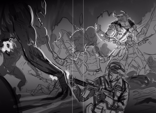
Just to give you a brief background on the scene: A small group of Marines and Minotaurs are battling for their lives against a horde of scourge and demons. You’ll have to read the book to know how this comes about and of course how it ends, but I’m really proud how I was able to work this whole scene into the storyline. He fit the rundown of weapons and armament I’d asked him to include into the scene. He also did a great job showing fully geared combat marines along with the female marine in the center of the action. I wanted her uniform to be slightly different. I wanted her to have the vibe of a feminine heroine, but at the same time in a uniform that made sense and befitted a female marine.
Now remember at this point the image is supposed to look indistinct. The main objective at this point between you and the artist is to get the general figures and over all scene into place with something that you both agree on the image layout and the cost. When Leo sent me back this first image, the one I posted in part one of this blog series, I thought the initial rough sketch looked great. Leo did an excellent job creating the general feel of a cavern and the layout of the characters that I wanted. I gave specific ideas of what I was thinking would look good, but he knows I’m open to him building the scene in a way he thinks is visually pleasing. An example is that I wanted one Minotaur falling back with one of his arms cut off and another running up with a shield and spike, but it didn’t fit within the space of the overall scene. Not to mention there is only so much room on the cover of a book. You want people to actually be able to see the scene. The wraparound he designed helps to get that fully scene feeling, but what’s most important is the front face of the cover. Leo wasn’t sure if he liked the scared marine in the very front bottom left of the picture and wanted to remove him, but he’d included it since it was in his initial rough draft.
I made some suggestions to Leo for him to tweak: First, I wanted the center Minotaur facing directly head on like the leader in the primary image I was asking him to emulate. (Aka this image: http://ukitakumuki.deviantart.com/art/Last-Chapter-190222071 ) Second, I wanted the female marine in the front to look more determined and scared and not that they were kicking ass. Also, I wasn’t thrilled with her firing two assault rifles at the same time, since she’s not Rambo or Arnold Schwarzenegger. I asked that Leo change one of the rifles to a pistol and have the clip kicking out like in this image: http://ukitakumuki.deviantart.com/art/Black-Library-Armageddon-381592220 . Lastly, I wanted to keep the scared marine in the bottom left, but I wanted both hands clutching the gun and for him to look terrified.
Leo and I shot a few several emails back and forth about a couple design features. He was afraid the overall image would look too static with some of my recommended changes. Melee weapons are static in pictures like this, while firing weapons give more feel of the overall action taking place. It was important to me for the Minotaur to be a central character on the cover along with the female marine. Partly because they are central characters and partly because you rarely see Minotaurs in anything except Tauren videos and pictures from World of Warcraft, which is sad really since they are so cool. I mean who doesn’t love a massive Tauren warrior wielding double-headed battleaxes? I also gave him a sample idea of how I pictured the attacking Scourge, here is a link to the image: http://i1-news.softpedia-static.com/images/news2/Namcoi-Bandai-And-Flagship-Studios-Partner-With-Dark-Horse-Comics-For-Hellgate-London-Comic-Book-2.jpg It’s from Mel Odom’s London Hellgate series. A series I highly recommend. Reading Mel Odom’s work really gets the imagination going and I loved the pictures in the graphic novel for the series, really amazing art work. While the Scourge are different, I figured this was an excellent base image to use in communicating some of the specific feel I wanted for the Scourge.
Anyway, it’s my book so I get to decide on the format … at least to a point. Below you’ll find the second rough draft from Leo for Destiny’s cover. Yes, it’s still supposed to look crappy like this.

 RSS Feed